


Images
Image optimization
Optimizing images for your website means using visuals that are the ideal format, size, and resolution to increase user engagement in small as possible file size.
Why is image optimization important?
Images account for nearly two-thirds of average webpage bandwidth, making them a primary culprit for slow load times.
A fast page load time is a big part of offering a good user experience.
Google uses page load time as a ranking factor in its algorithm: If the images are not optimized, it may have a negative impact on Search Engine Optimization (SEO)
(For web editors: A page larger than 2MB needs optimization. You can check your load time with an online tool: PageSpeed Insights)
What sizes and resolutions are the best for web publishing?
Finding the balance between an image that is high-resolution enough to be engaging yet optimized for faster load times is more of an art than a science. The content surrounding the image, as well as the number of other images on the page, have an impact. The goal should be to minimize the file size of the image as much as possible without sacrificing its quality.
As a rule of thumb, if the image file size is between 700kb - 1MB or larger, optimization maybe needed.
Tips for optimization
Vector art or any line artwork works well even in very low resolutions: Use the smallest possible resolutions for those. (In some cases these types of images can look fine even at 100 kB or under)
When it comes to clinical photos, it is vital that the details remain clear and precise. To ensure this, it is recommended to use a higher resolution than is typically used for stock photos or other images that are used for aesthetic purposes. If the file size for a single image is approaching 1MB, you should consider using a lower resolution. You can use Photoshop's optimization tools that allow you to compare the different output options to determine the best compromise between detail and file size.
What image format should I use when submitting images to the web?
PNG for images where details are important. This format is the least compromising (lossless). Vector images also work well in PNG.
JPG (same as JPEG) is the most common format for photos and is recognized by all browsers. It’s a good image format for printing. JPG is called “lossy” because every time you resave the image in a smaller format, it loses some of the detail.
GIF images are mainly good for small animations.
WebP is Google’s own photo format. Do not use it when submitting photos as many photo editing tools don’t recognize this image format. Contentful, our CMS converts the images on our website automatically to this format.
HEIF stands for High-Efficiency Image File. Although a great, new, lightweight format, it is not common enough (as of March 2023) to be submitted for web use. Many browsers and photo editing tools don’t recognize this format. The same applies to AVIF files.
IMPORTANT: The color mode for images for the web has to be RGB (not CMYK)
Contentful (AAD’s CMS) and images
Contentful converts all our images to the Google format of WebP.
That compresses the images very slightly. On average the compression is between 2-7%. This is not enough to make the image optimized, so the responsibility to optimize the image is on the web editor responsible for publishing the page.
Contentful's image editing tool is not at this stage (2023) ideal for image editing. A third party tool, such as Photoshop, has to be used for image optimization.
Learn more about image optimization in a Contentful blog post.
Images and UX
Images from UX perspective
Research has proven that images work better for recall than text. Images on the page will also be noticed first, making them an invaluable tool for drawing attention to the most important content on the pages and creating an engaging experience for viewers.
When including visuals, always ask “what” and “why” to ensure that the message is clear and relevant for the intended audience. Think about the main message you want to convey, and use visuals to evoke the desired emotions and strengthen the overall experience.
Use of PDFs
The case against PDFs
Research has shown that PDFs should be avoided whenever possible. Always consider first what the user case is: If the user is likely to print out a coding sheet or a checklist, the PDF maybe justified, but if the expectation is to have the user read it online, make the content available on the website. If the supplemental PDF is necessary, offer it in addition to having the information available on the site.
Why are PDFs a poor experience?
They are designed for printing:
They often follow printing dimensions which makes the reading experience in the browser cumbersome.
They don't adhere to web writing guidelines or web accessibility standards.
They don’t show a standard navigation like a website: Users often struggle to understand where they are, and how to get back to where they were.
Burying information in PDFs means that most people won’t read it
Hundreds of usability studies have found that people strongly dislike PDFs and avoid having to read them.
For web editors: How to write good Alt text (Description of an image in Contentful)
Accessibility: Alt text helps ensure your visual content is accessible to all users, including those with visual impairments.
SEO: Alt text helps Google to better understand not only what the images are about, but what the webpage as a whole is about. This can help increase the chances of your images appearing in image search results.
How to write good Alt text
Describe the image, and be specific. Use both the image's subject and context to guide you. Don't use the name of the component, such as "card image for...."
Don't start alt text with "picture of..." or "Image of..." Jump right into the image's description.
Add context that relates to the topic of the page.
Keep your alt text fewer than 125 characters.
Use your keywords, but sparingly. Only include your article's target keyword if it's easily included in your alt text. If not, consider using the most important terms within a longtail keyword.
Don't add alt text to decorative images; If there is an image on the page that has no connection to the content or the organization, such as a decorative border, you can leave the alt tag empty.
Examples of Alt text:
Good:

Bad:

IMAGE TYPES ON OUR SITE
Hero images for landing page templates
The hero images for the home landing page template are exactly 600px X 400px.

Code library assets: https://assets.aad.org/html/Components/heroBlock.html
Hero images used on regular pages
Recommended size is 1200 px X 400 px. It's important to optimize these images so that they don't have a negative impact on the page loading time.

Card images
To keep the cards consistent, we prefer to have them cropped to have the same ratio of 3 X 2 (typically card images are 800 X 533 px but can be even smaller). If you use different ratios, make sure that the images in that section are all the same ratio.
Always check your mobile view before publishing. Card images take up the entire width of the mobile screen: Very low-resolution photos may look too pixelated in mobile.

Lorem ipsum dolor sit amet, consectetur adipiscing elit, sed do eiusmod tempor incididunt ut labore et dolore magna aliqua. Hendrerit dolor magna eget est. Sagittis purus sit amet volutpat consequat. Sit amet mauris commodo quis imperdiet.

Keep in mind that the cards are there just to give a very brief introduction to the content: Keep the text section very short. The character limit in our content management system for card text is 256 characters including spaces.
Image block
The same rule applies here as for the card images: If your use case supports using 3x2 ratio image, use that ratio consistently.

In the latest issue....
Lorem ipsum dolor sit amet, consectetur adipiscing elit, sed do eiusmod tempor incididunt ut labore et dolore magna aliqua. Vitae proin sagittis nisl rhoncus mattis. Turpis massa sed elementum tempus. Elementum tempus egestas sed sed risus pretium quam vulputate. Facilisis leo vel fringilla est ullamcorper eget nulla facilisi. Ut sem nulla pharetra diam sit amet nisl suscipit adipiscing.
Lorem ipsum
Lorem ipsum dolor sit amet, consectetur adipiscing elit, sed do eiusmod tempor incididunt ut labore et dolore magna aliqua. Vitae proin sagittis nisl rhoncus mattis. Turpis massa sed elementum tempus.Ut sem nulla pharetra diam sit amet nisl suscipit adipiscing.Ut sem nulla pharetra diam sit amet nisl suscipit adipiscing.
Elementum tempus egestas sed sed risus pretium quam vulputate. Facilisis leo vel fringilla est ullamcorper eget nulla facilisi. Ut sem nulla pharetra diam sit amet nisl suscipit adipiscing. Morbi blandit cursus risus at ultrices. Mattis pellentesque id nibh tortor id aliquet. Nisl tincidunt eget nullam non nisi est. Non curabitur gravida arcu ac tortor dignissim convallis aenean et.

What is compounding
Compounding is when a dermatologist combines, mixes, or alters ingredients of a drug to create a medication tailored to the needs of an individual patient.
The purpose of the image block is to a.) draw attention to specific content b.) guaranteeing a good mobile experience.
Often used instead of inline image with a caption.
Stay consistent with your color choice for image blocks for that section. Most blocks are either light gray or white.
Use title and description.
If the text is so long that it runs passed the image, use image block with white background.
Stay consistent with the image ratio. (Typically 3x2)
Image grid


Inline image

Use for images with short captions. If caption is longer, use an image block.
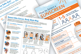
Example: https://www.aad.org/public/diseases/skin-cancer/types/common
Code library assets: https://assets.aad.org/html/Components/imageWithCaption.html
Images with lightbox
Assets: https://assets.aad.org/html/Components/imageWithCaption.html#_

Promo block
Artificial nails
are not recommended if you have problems with your nails. Covering up brittle, soft, or damaged nails can worsen existing nail problems.


Read the latest issue here
Lorem ipsum dolor sit amet, consectetur adipiscing elit, sed do eiusmod tempor incididunt ut labore et dolore magna aliqua. Vitae proin sagittis nisl rhoncus mattis. Turpis massa sed elementum tempus. Elementum tempus egestas sed sed risus pretium quam vulputate. Facilisis leo vel fringilla est ullamcorper eget nulla facilisi.
Promo block is a nice way to break up a very text-heavy page and highlight something important.
Intended for short, one sentence messages. If the text extends past the image, use a white background.
Light grey box is recommended, but use your best judgement and take other elements on the page into consideration.
Stay consistent with image ratio. (Typically 3x2, but your use case may require different ratio: Just stay consistent)
Example:
https://www.aad.org/baths-showers
https://www.aad.org/burnout/recharge/subtle-signals
Code base library asset: https://assets.aad.org/html/Components/promotionalBlock.html
Slideshow


Media carousel
Media carousel uses the image block or video block component: It chains a group of blocks into a carousel. The interaction is not automated but relies on the user to click on the arrows on both sides of the image. The perfect use case for this component would be for example, a situation where the topic keeps changing from month to month but the older posts also need to live on the page. Or if the topics that are further down the carousel, are something that don't necessarily demand the user's immediate attention, but need to be available on the page.
Do not use this component expecting the users to always click through the carousel: If all topics/videos are important to be visible and readily available, do not use this component: SImply use the image or promo blocks or cards.
Fact: Tanning beds are not safer than the sun
Accoding the AAD survey, nearly 25% of young adults were either unware or unsure that tanning beds are NOT safer than the sun.

Fact: Tanning indoors makes your skin age more quickly
Indoor tanning dramatically speeds up how quickly your skin ages.

Fact: By choosing not to tan, you reduce your risk of getting skin cancer
Women who tan indoors before they turn 30 are 6 times more likely to get melanoma, the deadliest skin cancer.

Featured image in navigation

Images for member section
AAD members come from very different backgrounds: Solo practices, small practices, large medical groups, hospitals and research: It isn’t easy to always find photography that will present them all accurately. This is why we have chosen to use illustrations on our landing pages and wherever else appropriate. In our user research, members preferred illustrations over photography. They found the illustrations to be less distracting and more neutral than photography. This kind of abstraction of the subject matter makes it easier to let the users focus on the content rather than getting distracted by the inaccuracies of stock photos. This doesn't mean that we should always steer away from using photos: They should be used when more appropriate. A good example of that would be meeting and education related imagery: Having authentic photos from the actual events is usually a better choice.
As a general guideline, the images are most often placed on the left side of the page, but this will vary according to the content and its length.
Images for public section
Public has a very different relationship with our website. They very rarely enter the site through the home page or landing pages. They typically look for answers to their skin problems with Google searches and end up reading specific articles. It is important to show the public the images that they need, but we should avoid showing images of very severe cases. Explaining things visually with infographics and data visualization when possible, would be also ideal. Using imagery and videos to help with learning is important for the public section.
Align images to the right when possible. Video component is an exception because it only allows you place the image in the left. (Image alignment is flexible in the member section. Align the images where they look best.)
Image credit placement

Example: https://www.aad.org/public/diseases/a-z/impetigo-symptoms